Combo Chart
The Combo chart displays multiple data series on up to two separate axes as line or vertical bar charts.
| Features | Quantity | Notes |
|---|---|---|
| Required Dimensions | 1-2 | Dimension 1 = X Axis, Dimension 2 = Series |
| Required Measures | 1+ | You can add unlimited measures, up to the capacity of your browser. |
The optional multi-series capability of the Combo chart can break out values by additional dimensions using up to two Y axes.
You can also choose multiple data sources and display data together on the same chart. There is no limit to the number of data sources you can display on a single chart, up to the capabilities of your chosen browser. You can use the same data source more than once, and choose a different set of columns to display.
Combo Chart Examples
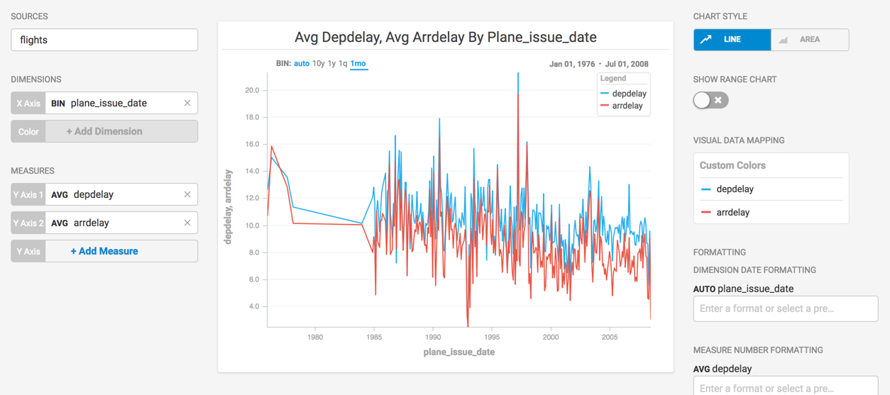
Create a new Combo chart. Choose a Data Source. This example uses the flights sample database.
Categorize on the Dimension plane_issue_date, the date the plane was first acquired. To see how on time performance compares to the aircraft acquisitions over time, set the measure for Y Axis 1 to depdelay, and the measure for Y Axis 2 to arrdelay. These measures are within the same range, and combine well on the chart.
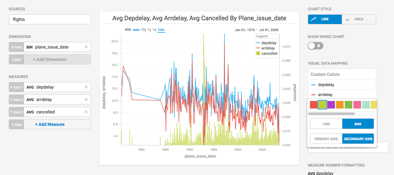
You might also want to see how frequently flights are cancelled, based on the age of the airplane. Add the cancelled field as Y Axis 3.
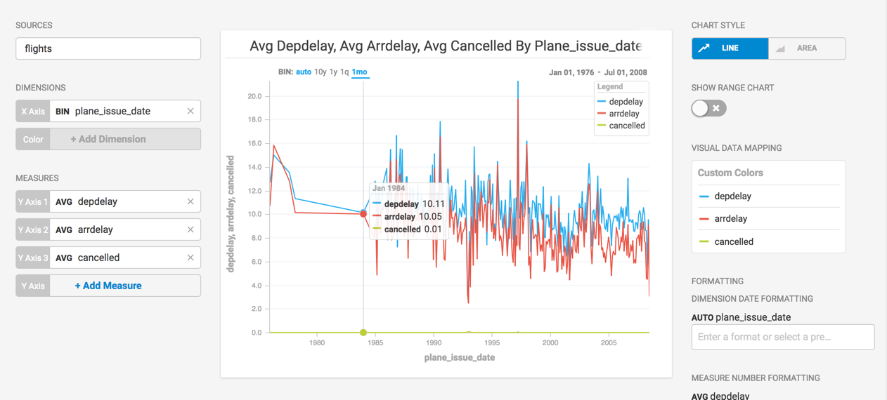
The difference in values makes it difficult to see how the trend of cancelled flights compares to flight delays. Click the line next to the cancelled item in the COLOR PALETTE list and choose Secondary Axis.
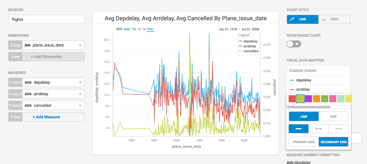
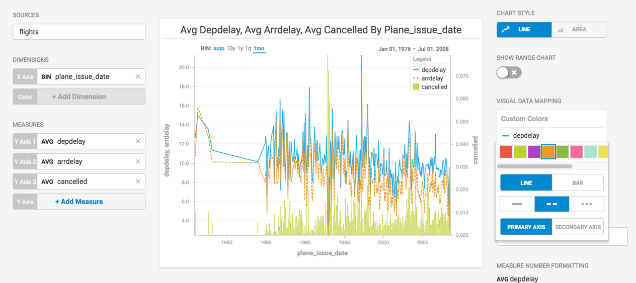
You can make the distinction clearer still by changing the secondary axis to a vertical bar chart.
You can also change the color and style of the lines in the chart to make them more distinct.
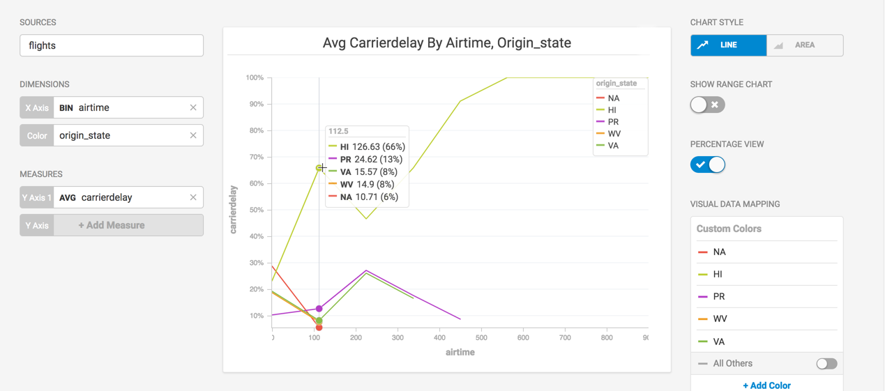
When you use a numerical dimension, you have the option of displaying the chart in Percentage View. The pop-up box displays not only the values for each item on the X axis, but also the percentage of the total values for that group.
Multisource Combo Chart Example
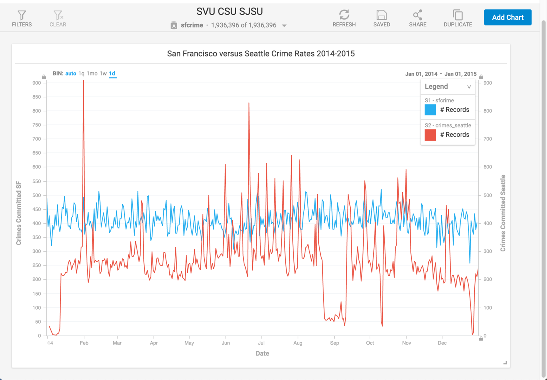
This example uses a dataset of crimes committed in San Francisco and another dataset of crimes committed in Seattle. We can compare them both on the same axis. Create a new combo chart, and select sfcrime as the Data Source. Choose DateEvent as the X Axis and #Records as the Y Axis.
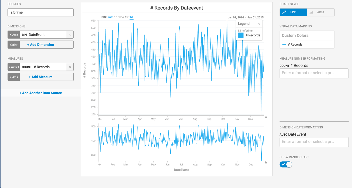
Click Add Another Data Source and choose crimes_seattle. Set the X Axis to At_Scene_Time and the Y Axis to #Records.
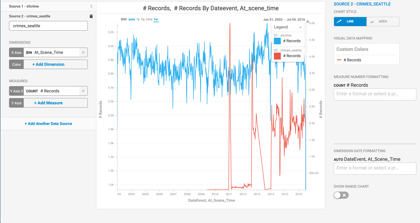
The datasets do not overlap completely. You can use the Range Chart to select a range for fair comparison. In this example, 01-01-2014 to 01-01-2015.
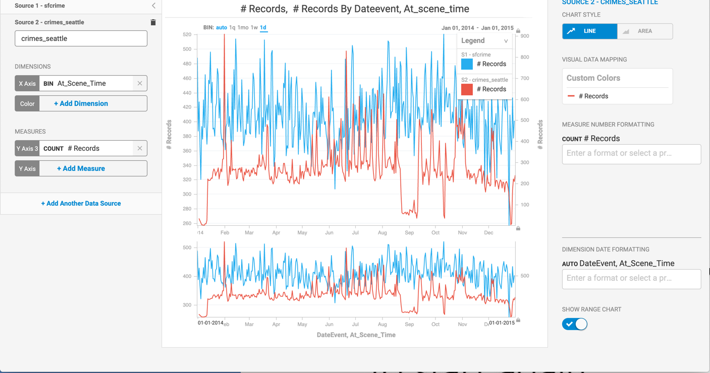
Edit the axis labels and title for clarity. Set the X-axis minimum to 0 and maximum to 900 to match the X-axis for Seattle. Click Apply. Your chart is ready for display on your dashboard.