Choropleth
The Choropleth lets you compare values by geographic region.
| Features | Quantity | Notes |
|---|---|---|
| Required Dimensions | 1 | Geographic dimension of Countries, States in the United States, or Counties in the United States. |
| Required Measures | 1-2 | Measure 1 = color. |
Choropleth comes from the Greek choros (area) and pleth (multitude). Immerse colors the map regions based on the measure you choose.
Use a Choropleth to compare aggregate values across regions. Choropleths are useful for spotting outliers, but are not intended to provide detail on the values within a region. (For detailed, point-level geographic information, consider using a Pointmap.)
Geo JSON Join
When you assign a map overlay, the region names in the dataset column you select must match the names in the overlay. The column you choose can spell out the name of the region, or use a standard abbreviation, but cannot use both.
For countries, you can use a dataset column with the two- or three-character abbreviation, or one that spells out the full name. See Country Abbreviations.
For US states, you can choose a column with either the full name or the two character abbreviation. See US State Abbreviations.
The list of supported US county names is provided in the file US County Names.
Color Palette
You can choose one of four quantitative gradients to represent the relative values for each area in the Choropleth.
Custom Measure Formatting
You can use custom measure formats for the values in your chart. See Customizing Measure and Date Formats.
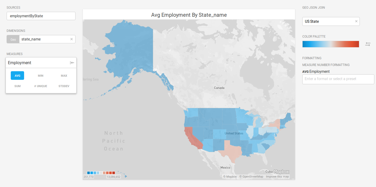
Choropleth Example
Create a new Choropleth. Choose a Data Source. This example graphs employment statistics for all 50 United States for the years 1980-2015. The data is available at the University of Kentucky website.
Set the Dimension to state_name and the Color measure to average Employment. Set GEO JSON JOIN to US State to overlay the defined geojson shapes onto the map.