Stacked Bar Chart
Stacked bar charts display values for one or two dimensions, one of which must be defined on the x-axis. Measures are displayed as the height and color of the bar for each dimension group. With stacked bar charts, you can display multiple measure/dimension combinations on each bar. This makes it easy to visually compare measures for the defined dimensions, as well as see the cumulative value for the defined measure.
| Features | Quantity | Notes |
|---|---|---|
| Dimensions | 1-2 | String values for X axis (required) and color (optional). Standard deviation (stdev) does
not work when using the color dimension. |
| Required Measures | 1 |
Stacked Bar Chart Examples
The following examples use the flights sample database.
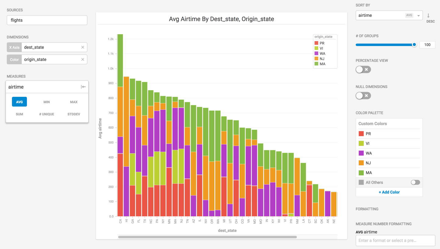
Stacked Bar charts use two dimensions (X axis and color) and one measure.
- Create a new Stacked Bar chart.
- Choose flights as the Data Source.
- For Dimensions, select destination state for X Axis and origin state for Color. To remove the null dimension on the X Axis, toggle Null Dimensions to off.
Note - If you omit the Color dimension, you create a single-color vertical bar chart.
- When you use the Color dimension, Immerse selects the top five categories for the dimension and measure. When the All others toggle is on, all categories not in the top five are shown as Other.
- For Measures, select the sum of airtime.
- Sort by descending airtime, and define the colors for origin states.
Note You can enable and disable All Others Color Palette, but you cannot add or remove categories. This creates a chart like the following, showing the cumulative airtime for flights, based on origin state and destination state. The origin state airtimes are stacked on the same bar, making it easy to see total airtime by destination as well as total destination airtime by individual origin.
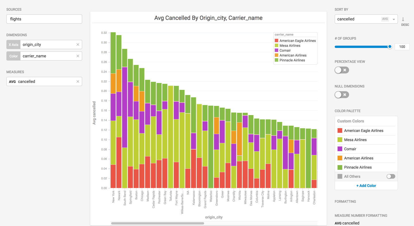
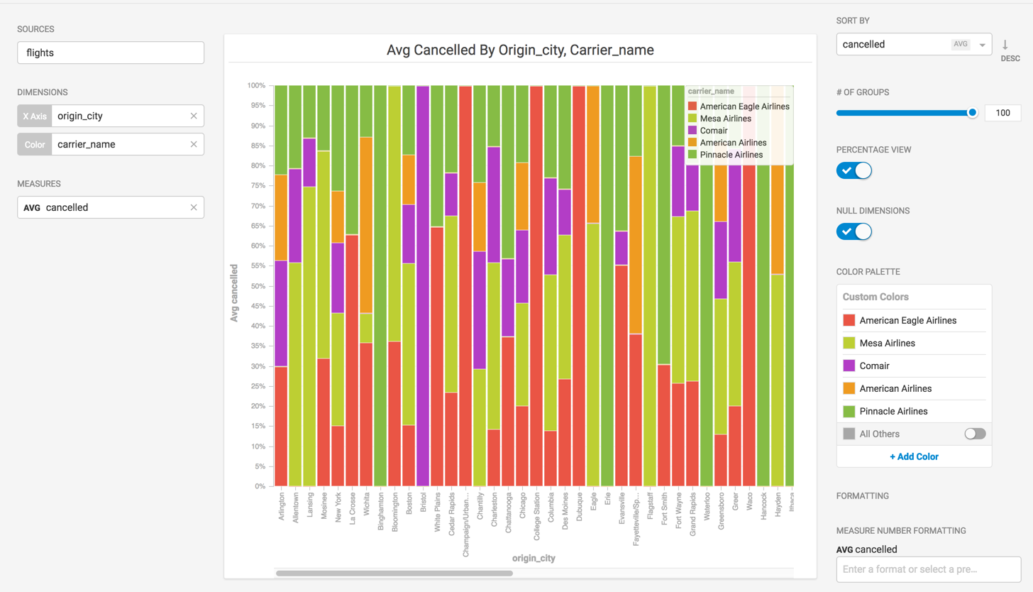
Now, adjust the chart dimensions and measures to see information about cancelled flights for particular origination cities for individual airlines.
- For Dimensions, select origin city for X Axis and select carrier name for Color.
- For Measures, select the sum of cancelled flights.
This creates a chart that shows the total cancelled flights for particular origin cities, broken out by air carrier.
If you prefer, you can set the Percentage View toggle to compare relative values within a dimension and side-by-side.
You can reduce the number of cities on the X Axis by sliding the # of Groups down (15 in the next example), and show the value for all other airlines by toggling All Others to On in the Color Palette:
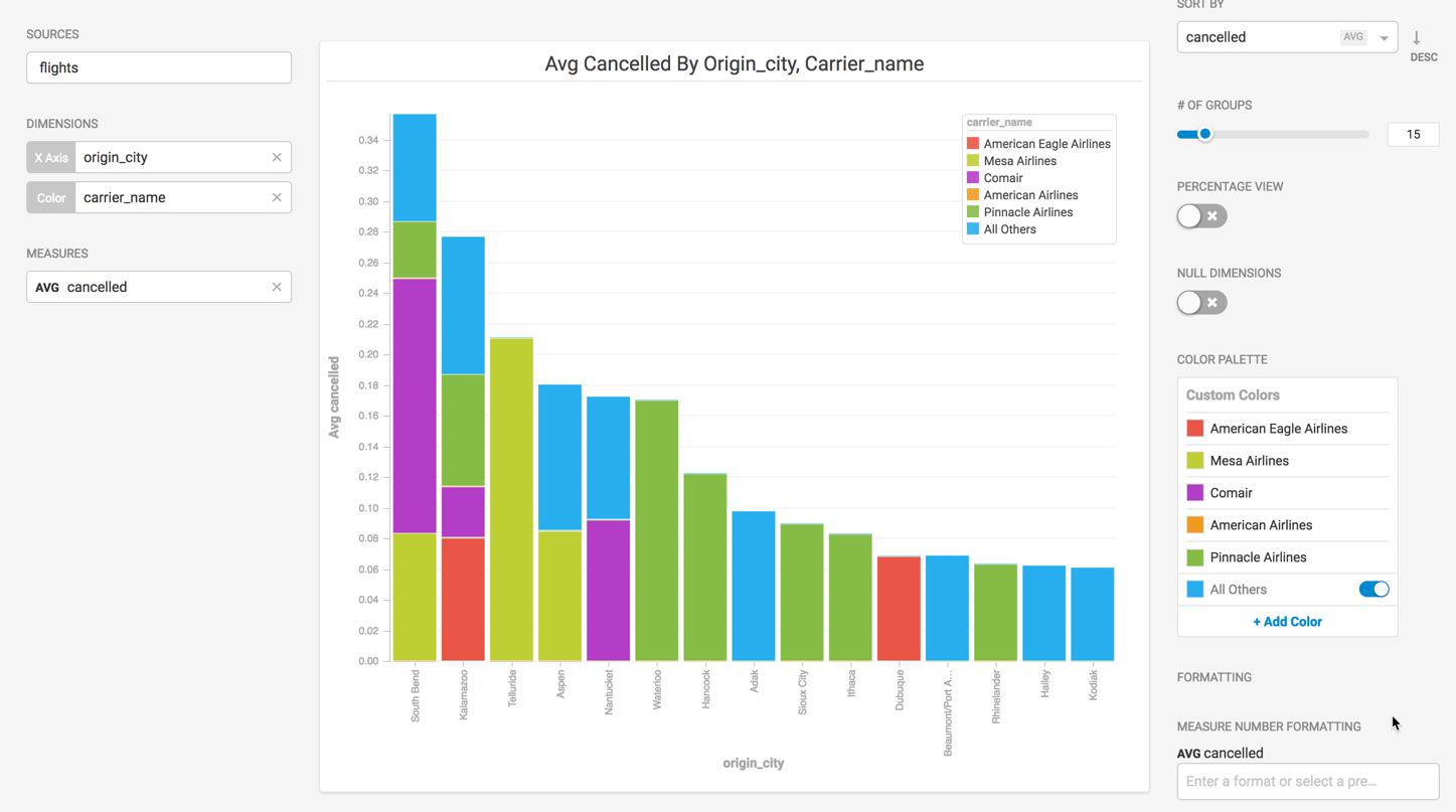
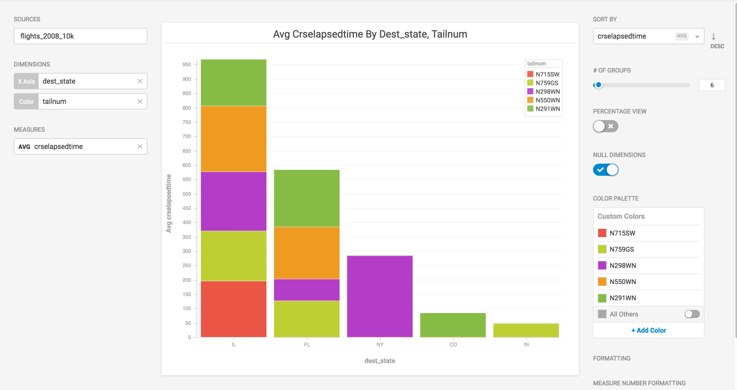
| Note | In some cases, if you disable All Others from the color menu, the # of Groups does not match what is shown on the x axis. For example, in the following chart, the number of X axis items for dest_state is five, but the # of Groups is set to 6.
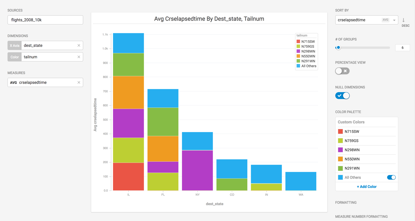
This occurs because the query that is returned has "undefined" for "key1" values, and these values are filtered out by Immerse. When the All Others toggle is enabled, these values are referred to as "other" instead and are grouped together, making the number of values on the X axis match the number defined in # of Groups.
|